There are many things to consider when it comes to increasing conversion rates, such as email subject lines, call-to-action messages, and using the right imagery. But sometimes, just changing the colors of your website and other marketing assets can do the trick. This article touches on color psychology and how you can use it to your advantage.
What is Color Psychology, and How Does It Work?
In marketing, color psychology refers to studying colors in human behavior. It’s used to identify how it affects day-to-day decisions, such as what brands we trust and what nudges us to purchase decisions. While it may not be obvious to some, there’s a reason why major social media platforms, such as Facebook, Twitter, and LinkedIn, use blue for their branding color schemes (more on this later). Why has McDonald’s mix of red and yellow become so universally known that you can put a different text under the logo, and people would still think of the colossal fast-food chain?
But before we proceed, it’s important to note that while colors can impact our impressions and feelings, their effects largely depend on factors like upbringing, gender, location, and values. For example, in some regions, black is a mourning color, while white is for others.

As you can see above, color psychology has identified what certain colors generally mean to most people. As alluded to earlier, blue imbues trust and reliability, which is why the previously mentioned social platforms choose it for their brand.
As such, when conceptualizing your branding, it’s important to pay attention to the colors you use – for your website, emails, and other marketing assets. As noted by Oberlo, strategically using colors in your branding and marketing campaigns lets your audience see what you want them to see and helps them perceive your brand the way you want it to be perceived.
Conversely, poor color choices can damage your brand image. They could also make your messages unreadable or turn people’s eyes away altogether.

Not only can colors influence how people think and feel toward a brand, but they could also help or hinder how they consume and process information. This is why marketers need to understand what different colors generally mean.
Colors of The Mind
Red
Red is often associated with excitement, energy, and action. As the most intense color, it can evoke the strongest emotions. In business, it’s often referred to as a call-to-action color.

As Impact points out, there are several prevalent uses of red to match specific emotions. Red hearts often mean love, while the cross in the Red Cross logo (and hospitals) symbolizes aid and support. In school, a teacher often marks incorrect answers with a red pen, and it’s also a universal signal for “Stop.”
Frequently, colors come with an emotional spectrum. Understanding this will allow you to use colors to your advantage by using them properly and tugging at the right emotion at the right time.
Yellow
As a color often associated with sunshine, yellow evokes happiness, positivity, and summer. Conversely, it’s also used as a warning. For websites, it’s an easy tool to use on borders to give a cheery feel. It’s also great for messages like “Free Shipping,” which catches users’ attention.
It’s important to note, though, that you need to be careful if you choose to use yellow as the primary color of your website. There’s a fine line between uplifting your visitors’ mood and annoying them with fake cheer.

Orange
Orange has been known to signify creativity, enthusiasm, adventure, and success. In marketing, it’s been used to add a sense of fun to any marketing material it’s on. It’s also commonly used for CTAs and areas of the website marketers want to draw attention to.

Orange combines red and yellow, combining the former’s power and energy with the latter’s friendliness and fun. It can also stimulate the appetite. As noted by Coschedule, orange is great for bringing comfort in tough times and lends a positive attitude and general enthusiasm for life.
Blue
You might notice that color psychology is often tied to nature. Blue, being closely associated with the sea and the sky, has been used to symbolize stability, calm, and trust. However, under a different light, it can also bring a sense of coldness and depression.
But it’s more often than not used in web design for guarantees and trust certifications to imbue reliability and trustworthiness. Some of the biggest brands, like Facebook, Walmart, and, to a lesser extent, Oral B, use it as their main color palette.

Green
Growth, fertility, and generosity are some of the traits associated with green, which is also highly associated with nature and money. This is why brands that want to evoke a healthy lifestyle often use green. Similarly, brands like John Deere, which revolve around nature, have been known to use green as their main color.
White
Innocence, goodness, and cleanliness are some things associated with white. However, as alluded to earlier, this is mostly true of the Western world. In some cultures, it could serve a different meaning. You need to keep this in mind when thinking of your web design and your audience.
Hue Profit: How to Make Color Psychology Work for Your Business
Before we kick this section off, it’s important to remember that in order to be effective, you need to use colors in the right way, with the right audience, at the right time, and for the right purpose. For example, if you want to promote something fun, vibrant colors would be best. Or, if you want to sell to women, brown and orange might not be the best choices. Below, we dive into how to use color psychology to drive conversions.
What women want

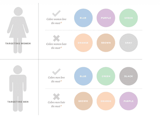
As noted by Neil Patel, a survey on color and gender showed that 35% of women said blue was their favorite color. Meanwhile, 33% said that orange was their least favorite, followed by brown (33%). Both other studies and real life have corroborated this. If you try and look at websites whose primary audience is women, you’re less likely to see orange, brown, or gray.

Instead, women prefer primary colors with tints as opposed to earthy tones.

Now, for the men
As it turns out, men also oppose orange and brown (and purple). Use blue, green, and black instead if you have a male-dominated audience. It’s important to note that while studies have shown these to be the preferred male colors, they are not as black and white (pun intended). However, it is a great starting point for A/B testing.
Orange!
It’s not all bad for orange, though. While both men and women rank it as one of their least favorite colors, orange can be used to create a sense of haste or impulse. It also helps stimulate physical activity, competition, and confidence (as Austrian motorcycle manufacturer KTM uses to the full extent).

But even if orange is not in your brand’s color palette, you can utilize it for CTAs and other information that you want to stand out. Amazon is a perfect example of this.

Remember that orange should be used sparingly, as it could overwhelm the message.
Back to black
Patel also points out that according to their internal color psychology, the darker the tone, the more sense of lux it imbues. As such, black has been used to symbolize elegance, sophistication, and power.

Louis Vuitton does away with all the fun colors for their website. Luxury handbags are serious business, and their website expresses that. Lamborghini also applies the same theory, as you can see below:

Vibrant CTAs
Orange isn’t the only color you can use for your CTAs. Bright, primary colors are also effective choices for them.

It may be counterintuitive, but some of the best conversion colors are often viewed as anti-aesthetic as they do well to capture attention.
White privilege
The use of white can serve as a powerful design feature. That’s why it features so much on the most popular website.

Ample white space on your website gives it a sense of spaciousness and breathability, calming visitors as they navigate it and find the information they need.
Don’t resist change
As mentioned earlier, while there are studies supporting color psychology, the evidence is not always clear. If your audience isn’t responding as desired, consider changing things up.
Even if your main colors are working, consider A/B testing different color options for your CTAs and special messages to find the ones that convert optimally.
Final words
Remember, there’s a difference between aesthetically pleasing color combinations and color psychology. A web designer may create an awesome-looking design, but if it doesn’t convert and visitors don’t perform the actions you want them to, then what good is it?
Also, don’t think you can’t shake things up. The bottom line is the business’s bottom line. If reaching that requires changing even the most primary colors in your branding, take the time to consider its potential effects.


