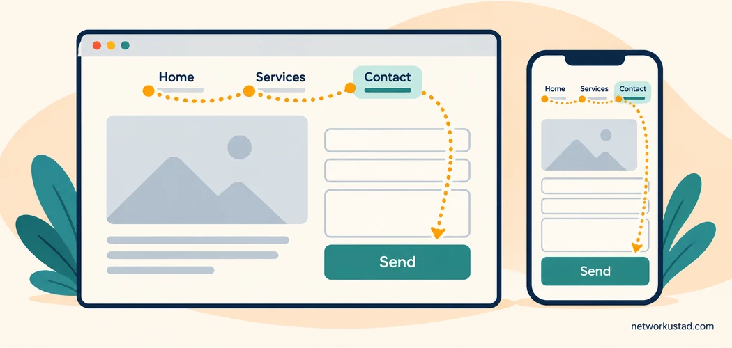
A website can look polished and still make ordinary tasks difficult. Visitors may struggle to find a service, understand a price, complete a form or discover who is responsible for the information they are reading. Adding another animation or publishing another short post will not necessarily solve those problems.
Building a successful website starts with deciding what people need from it, then making those tasks clear and dependable. Search visibility matters, but so do the experience after the click and the work required to keep the site accurate.
The five checks below suit small-business sites, professional portfolios and information-led publications. Adapt the examples to your audience. An online shop, a local service company and a technical tutorial site will need different features, even when they share the same basic principles.
1. Define what a successful website means for your visitors
Start with a practical question: what should someone be able to accomplish here? Avoid answering only with a business target such as “get more traffic.” Traffic describes arrivals; it does not explain what makes the visit useful.
For a repair company, the task might be checking the service area and requesting a quote. For a training provider, it might be comparing course requirements. For a publication, it could be finding a reliable explanation and a useful next step.
Choose a small number of priority tasks. List what visitors need to know before taking each action, what might stop them and what a completed task looks like. This becomes a more useful brief than asking a designer to make the site “modern.”
Give each important page a clear purpose
A successful website does not ask every page to perform every job. A service page should explain the service, relevant limitations and the next action. An article should answer its central question. A contact page should make suitable contact methods easy to find.
For example, a hypothetical repair-service page could state the appliances covered, locations served, how appointments work and whether inspection charges apply. A clear “Request a repair” button then follows information that helps someone decide. This is an illustrative layout, not a measured conversion result.
Remove competing requests that distract from the page’s purpose. A visitor trying to report a problem should not have to dismiss a newsletter invitation, an unrelated promotion and a chat overlay before reaching the form.
Choose useful measures of completion
Match measurement to the task. A submitted inquiry can be useful to track, but check whether it reached the right inbox and contained enough information to act on. A download count alone does not show whether a guide answered the reader’s question.
Use a combination of business records, appropriate analytics and direct feedback. Record a baseline before making a change, and note other events that could influence the result. A seasonal increase in demand should not automatically be credited to a new button color.
Collect only the information you need and handle it under the privacy requirements that apply to your circumstances. Measurement should help improve the service without creating unnecessary collection or misleading claims about visitor behavior.
2. Make the route through your successful website easy to follow
Navigation should reflect the words and choices your audience understands. Internal department names and clever labels may mean little to someone arriving for the first time.
Use recognizable labels such as Services, Pricing, Resources and Contact where they fit. Keep the main navigation focused, then organize detailed material within relevant sections. A large menu is not automatically comprehensive if visitors cannot tell which option leads to their answer.
Write descriptive links and next steps
Links should give a reasonable preview of their destination. “View installation requirements” is more informative than “Click here.” A link promising a pricing guide should not lead to a homepage, a generic search result or an unrelated product category.
The same standard applies to internal links in articles. Add a link when another page answers a natural follow-up question. Do not insert one merely because it shares a broad keyword. Before linking, open the destination and check its topic, status and usefulness.
For a successful website, the action after reading should also be clear. A reader comparing services may need a quote form; someone reading a troubleshooting guide may need the next diagnostic step. Match the invitation to the page instead of repeating the same sales message everywhere.
Organize content for scanning
Use a descriptive page title and headings that reflect the sections beneath them. Keep related information together and introduce a table or list when it makes comparison easier. Short paragraphs help on small screens, but breaking every sentence into a separate block can make an explanation harder to follow.
When a site contains many articles or products, test category names, filters and search using the terms visitors actually use. Include a helpful empty-results message and an alternative route when nothing matches. Search should support the structure, not compensate for a confusing structure indefinitely.
Check navigation on a phone as well as a desktop. Menus must open, close and remain usable without hiding the content or forcing someone to guess which icon matters. Also check links in the footer, confirmation messages and older pages; these are easy places for obsolete destinations to survive.
3. Publish useful content and apply sound search basics
A successful website earns attention by answering real questions accurately. Posting every week is not a substitute for improving an unclear service page, correcting an outdated comparison or finishing a guide that leaves readers without an answer.
Begin with the audience’s questions and the information you can support. Explain the subject directly, distinguish facts from opinions and provide examples that help readers apply the advice. If a statement depends on a source, check that the source actually supports it.
Make accuracy and ownership visible
Identify the responsible business or publication and provide a meaningful way to contact it. Where a byline is appropriate, assign it to someone who actually contributed. An author profile should accurately describe relevant experience rather than imply qualifications the writer does not hold.
Product comparisons need precise model names, dates and limitations. Prices need a market and a checking date. Testimonials require permission and accurate context. Label hypothetical examples as hypothetical so readers do not mistake an illustration for a documented customer result.
Review information when its underlying facts change. An updated date should reflect a meaningful review or revision. Keep a simple record of what changed, who checked it and which sources mattered, especially for advice affecting money, safety or important decisions.
Treat SEO as support for useful content
Google’s SEO Starter Guide explains practices that help search engines understand content and help users discover it. It does not promise a first-place result. A score from a plugin or audit tool is a diagnostic aid, not a guarantee of ranking.
Use a clear title, an accurate main heading and relevant language in the places readers expect. Write a concise description that represents the page honestly. Link important pages through a sensible site structure, and check that public pages you want discovered are not accidentally excluded.
Avoid treating keyword repetition as the purpose of the page. Use the terms needed to explain the subject naturally. A successful website also needs consistent facts, working links and a useful experience after a visitor arrives.
Separate search questions when investigating a problem. Can the search engine access the page? Has it indexed the intended URL? Does the page appear for relevant searches? These are different checks. Search Console can help investigate indexing and search performance; an HTTP 200 response alone does not answer all three.

4. Make the successful website usable on different devices
Visual simplicity can help, but “minimal” is not a complete usability standard. Removing labels, hiding navigation or making controls difficult to recognize can leave a page looking clean while making it harder to operate.
Check the actual content and interactions on representative pages. Include a long article, a form, a service page and any important search or checkout flow. A polished homepage does not establish that the rest of the site works well.
Include basic accessibility checks
Start with readable text, meaningful headings, descriptive controls and sufficient contrast. Do not rely on color alone to communicate an error or a required action. Give informative images appropriate alternative text; decorative images need different treatment from images that convey essential information.
Navigate with the keyboard. Can you reach the menu, links and form controls? Is the focused element visible? Can you dismiss an overlay and continue? Try enlarging text and check whether important content or controls become obscured.
Forms need visible labels and understandable error messages. Tell people what information is required and how to correct a mistake. A placeholder that disappears while typing is not a dependable substitute for a label, and an unexplained red border may leave someone unsure what went wrong.
W3C’s Easy Checks for web accessibility provides a starting point for this review. These checks can reveal barriers, but passing them does not establish complete accessibility or compliance with every applicable requirement. More thorough evaluation may be necessary.
Check loading and interaction, not just appearance
A successful website should let visitors begin their task without unnecessary delay. Large images, oversized scripts and third-party widgets can increase the work a browser must perform. Review their effect before adding another feature that duplicates something already available.
Resize images for their intended use, choose an appropriate format and check that text remains legible in illustrations. Reserve space for images and embedded elements so the page does not unexpectedly move while someone is trying to read or select a control.
Performance tools can help identify loading, responsiveness and layout-stability problems. Treat their findings as evidence to investigate, rather than chasing a perfect score at the expense of necessary functionality. Where available, compare measurements from real visitors with controlled tests; one test run does not represent every device or connection.
After changing an image, script or caching setting, check the important interactions again. A faster-looking page is not an improvement if a form stops submitting, a menu disappears or information becomes unavailable to some users.
5. Maintain the site and improve it using evidence
Launching a successful website is the beginning of an operating responsibility. Content changes, integrations fail, staff move on and external destinations disappear. Someone needs to own the review process, even when a contractor handles technical work.
Keep a short maintenance register. Record the important pages or functions, the person responsible, the last check, the issue found and the next action. A practical record that people use is better than an elaborate checklist nobody updates.
Prioritize failures that stop ordinary tasks
Start with problems that block access, lose inquiries or mislead readers. A broken booking form deserves attention before a decorative animation. An obsolete price or incorrect eligibility statement may be more consequential than a minor spacing inconsistency.
Use a safe testing approach. Avoid sending real customer information through experiments unnecessarily, and check whether a test form submission triggers messages or other actions. Where possible, test significant changes in an appropriate preview environment before publishing them.
Security is part of dependable operation. Maintain supported software, restrict administrative access and understand backup and recovery arrangements. The site’s website security design guide explores protection during planning and development; use it as a related topic, rather than a replacement for a system-specific assessment.
Review links and removed pages deliberately
Check links in important content, menus and automated messages. A destination can return a successful HTTP response while showing a homepage or unrelated material, so status codes alone are not enough. Verify that the promised information is still there.
When removing a page, choose a redirect only if the replacement genuinely serves the same need. Otherwise provide an appropriate not-found or gone response and remove obsolete internal links. Sending every old URL to the homepage can leave visitors confused about where the promised content went.
Keep backups appropriate to the site and verify the recovery process. Assign responsibility for renewals, contact addresses and access when a staff member or supplier changes. A successful website should not depend entirely on one person’s memory or a single inaccessible account.
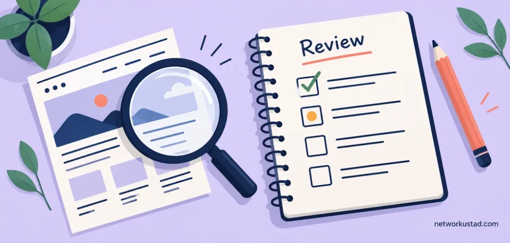
A practical review sheet for your successful website
Use the following questions on a small set of representative pages before expanding the review. Record an observation and an owner for each problem rather than marking everything simply “good” or “bad.”
| Check | Question to answer | Example evidence |
|---|---|---|
| Purpose | Can a first-time visitor explain what this page offers? | Notes from someone unfamiliar with the page |
| Navigation | Can the visitor find the next relevant step? | A completed task and any confusing labels |
| Content | Are important statements current and supported? | Checked sources, terms and review dates |
| Usability | Can the task be completed on different devices and with a keyboard? | Specific barriers and test conditions |
| Operation | Does the action reach the right person or system? | A confirmed test inquiry or booking |
The sheet is an organizational aid, not a validated scoring system or proof of legal compliance. Adapt it to the site’s actual functions. A publication may need stronger source checks, while a shop may need more detailed payment and order tests.
If an improvement appears to help, record what changed and what you observed. If it does not, investigate the underlying problem rather than adding more features automatically. Small, understandable changes make it easier to learn what matters to your audience.
Frequently asked questions
Does a high SEO score guarantee a first-page position?
No. A tool can flag issues against its own checklist, but it cannot guarantee how Google will index or rank a page. Use scores alongside content review, search data and checks of the actual visitor experience.
How often should a business publish new articles?
Choose a schedule you can sustain while keeping the content useful and accurate. Some sites benefit more from improving existing material than adding another post. Review urgent factual changes promptly instead of waiting for the next publishing slot.
Is a minimalist design always better?
No. Clear priorities and understandable controls matter more than removing as much as possible. A detailed comparison or complex service may need more explanation. Keep the information people need, and organize it so they can use it.
What should I fix first on an established site?
Start with failures that prevent important tasks or provide materially incorrect information. Then address recurring navigation, accessibility and performance barriers. Assign ownership and verify the result before moving on.
This article provides general educational guidance on website planning, content, SEO and usability. It does not guarantee search rankings, traffic, sales, security or accessibility compliance. Examples and checklists are illustrative. Assess changes against your own users, systems and applicable requirements, and obtain qualified help when needed.