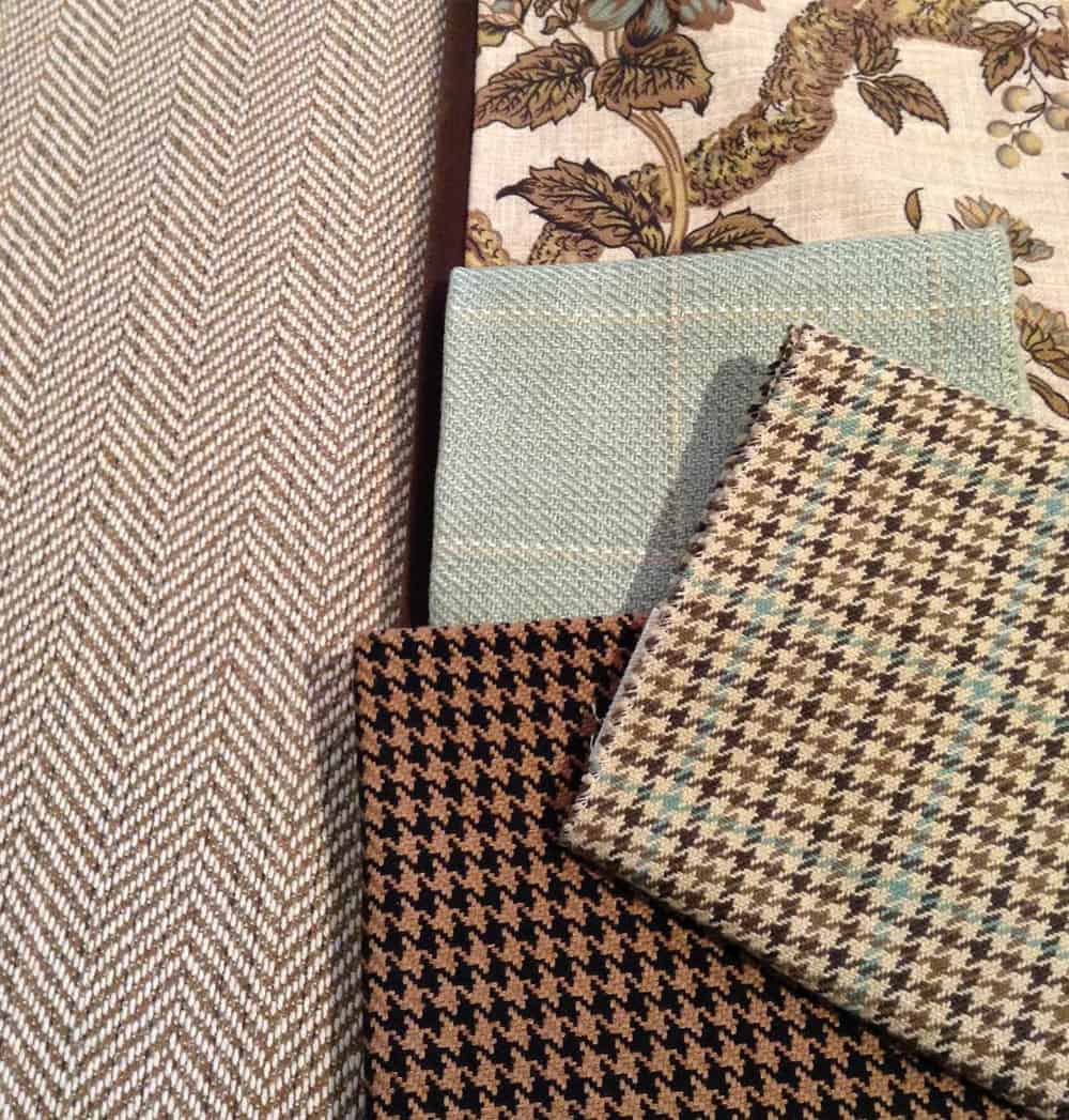
Mixing different patterns in a room to create a cohesive look can seem incredibly intimidating. But be assured, with a little insider knowledge and interior design tips provided in this article, you will become a pro at mixing patterns with the sophistication of an interior designer.
There is no dearth of patterns indeed: florals, stripes, polkas, plaids, chevrons, paisley, ombre, herringbone twill, houndstooth….on and on. Knowing the right mix of patterns for your space is an art in its own right, and while there’s nothing wrong with picking two or four patterns, designers swear by three being the magical number when it comes to a balanced look. When employed in controlled levels and mixed designs, patterns truly rescue a space from monotony. Just follow these five basic rules…
Scaling
One of the most important principles of mixing patterns, scaling helps to tone down or flare up the effect of a pattern. Try to pick patterns in a range of scales – one large, one medium and a small to avoid monotony of scale. For example, a narrow stripe on pillows, a midsize geometric rug and a set of bold floral custom roman shades would prove winners in any room.
Placement
The size of a pattern should invariably be in tandem with the size of the surface it is going to cover. So, large scales typically suit walls, extra wide custom curtains and rugs, and small scales suit smaller furnishings like cushions, throws, vases etc. Miniscule patterns simply get lost on a large surface. And no matter how simple a pattern may be, when used in large scales, they overwhelm the eye. Also, it’s best to start with the largest pattern first to serve as an anchor for other patterns and accessories. Once you have your bold showstopper fabric in place, find other fabrics that will complement your choice.
Colors
Colors, besides shapes, define the power of a pattern. A herringbone structure in a mix of high contrast black-white combo will shed its force in a lavender-white palette. While mixing patterns, one way of dealing with the color aspect is to let it be the common denominator. They need not match exactly, but make a cohesive blend of tints and shades of the same color. Another approach is to use complementary colors schemes. Say green-white stripes and red-white florals. Or use high contrast colors. So, indigo-white ikat prints and yellow-bluish grey polkas can vibe well together, for example.
Solid visual breaks
Patterns get to be the star only when grouped with plains. Since shapes are eye-engaging, a pattern overload without solid visual breaks bridging them can look cluttered, undermining the real aim to create a high vibe. For a harmonious blend of different patterns, interjecting elements in plains is necessary. These solids may be in either cool neutral colors for a play of contrast or the colors defined by the patterns to make them complementary.
Grouping
Group up patterns to tie up a space with a common theme. And while two or four patterns can be pulled off successfully, designers swear by three being the magical number when it comes to grouping patterns. Why three? Because two may look sparse and more than three may easily become visual noise. So, to keep a tab on the use of patterns, pattern trinity and grouping is a smart guiding principle in interior design. Make a mix of complex and simple patterns for a fun play with shapes. So, the rounded whimsical finishes of polkas or florals contrasted beautifully by the straight lines of plaids or stripes together make the place very captivating.
Distribution
Employ balance in distributing patterns in the room. Despite using slice-of-heaven materials, colors and designs, if they are not placed evenly across the whole length and breadth of the room, they will fail to fulfill their purpose. Take care not to cluster the arresting patterns onto one side of the room leaving the other banal with plains. The eye will be drawn automatically to the side which employs patterns. Meticulous planning is needed to ensure the balance.
Closing the game
Exercising the five principles diligently can make a fabulously attractive and cozy room. Even if following them may sound like a daunting job on first read, the fact is that when you actually get into a designing project, you follow them instinctively. These principles only identify and name those instinctive decisions for convenience. We hope this article will truly be of help to you to make your design decisions smart and easy.


