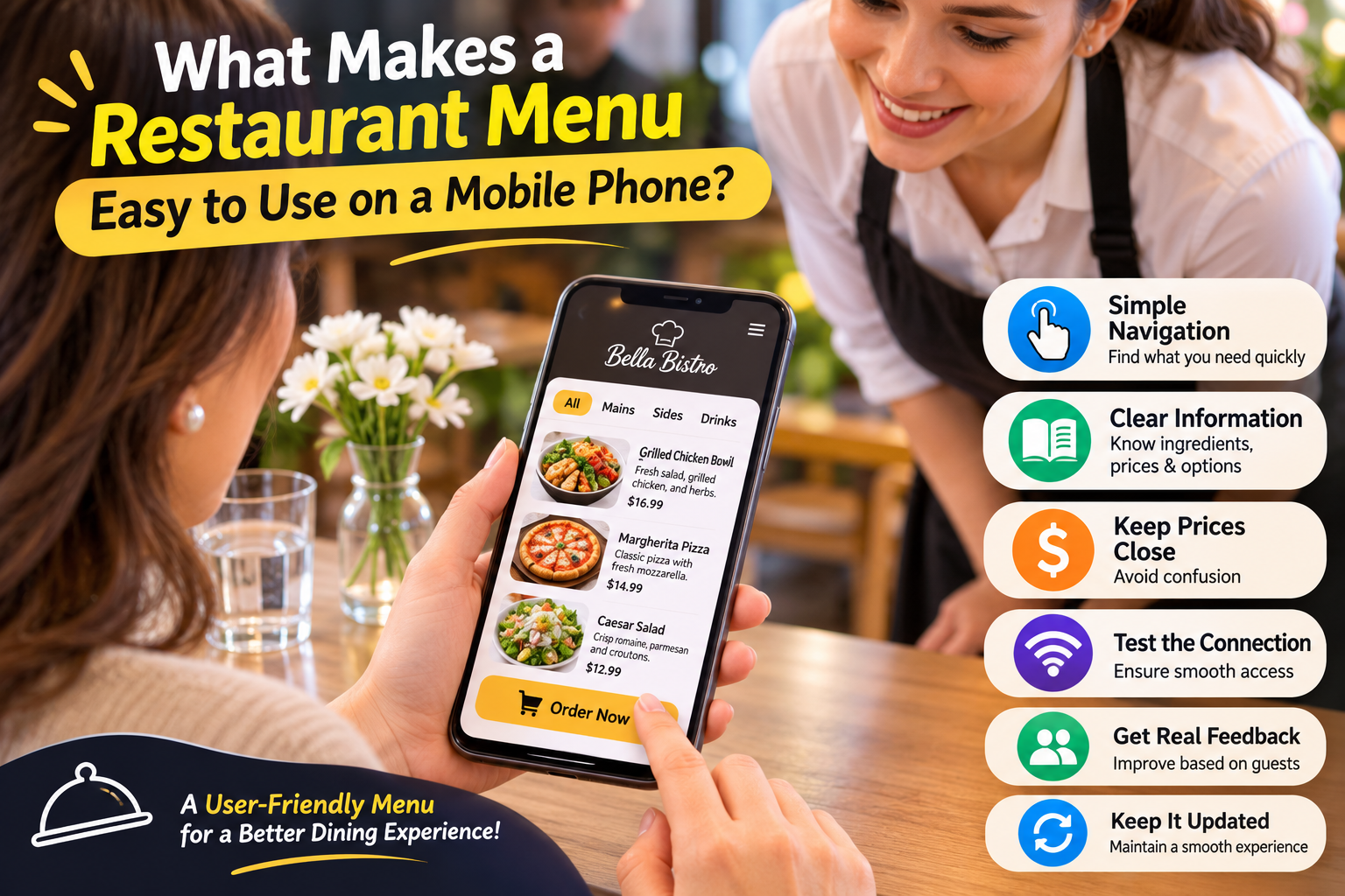
Picture a guest holding a phone in one hand while a server asks whether the table is ready to order. The guest is not evaluating interface design. They are looking for a particular dish, checking a price, or trying to find out whether an accompaniment is included. A mobile restaurant menu succeeds when those small tasks feel straightforward.
That perspective changes the design brief. Rather than asking how much information can fit on a screen, ask what a diner needs at each point in the visit. Good mobile usability depends on readable content, predictable navigation, and a clear relationship between browsing and ordering. It also depends on choices the restaurant makes outside the software.
Begin with tasks instead of visual effects
List the most common things guests need to do. They may want to locate vegetarian options, compare drink sizes, check a dessert price, or return to a category they saw earlier. If online ordering is enabled, they also need to understand how selections become an order. These tasks provide a more useful test plan than a general instruction to make the page attractive.
Choose a small set of tasks that represent your service. A café and a hotel dining operation will not have identical priorities. Avoid adding complexity simply because a platform offers another setting. Each visible element should help a guest understand the menu or complete the intended action at that venue.
Use categories that match a diner’s expectations
Navigation works best when labels are immediately understandable. Familiar headings such as breakfast, mains, sides, and drinks usually require less interpretation than internal kitchen terminology. A creative section name can still work if the dishes beneath it are obvious, but it should not force guests to explore every category to find a basic item.
Keep the organisation consistent between the digital menu and staff explanations. If the server describes a lunch special, it should be easy to locate under a relevant heading. Watch for categories that overlap without a clear reason. An item appearing twice with different information creates uncertainty even when both entries look polished.
Replace print assumptions with screen-friendly content
A menu designed for a large sheet of paper may contain tight columns, decorative type, and notes positioned far from the dishes they explain. On a small screen, those decisions can make the guest zoom and pan repeatedly. A mobile-friendly version should present information in an order that remains clear while scrolling.
A QR menu platform such as MenuForma can import an existing PDF, photograph, or website menu into editable dishes and categories. Importing is only the beginning. Review the results, shorten unclear labels, and make sure each description remains useful when it is viewed independently from the original printed layout.
Make descriptions answer practical questions
The title should identify the dish, while the description fills the most important gaps. Mention the main components, preparation, and relevant portion information. If an accompaniment is included, say so clearly. If guests choose a size or an extra, use consistent language that distinguishes the base item from the option.
Do not make photographs carry essential information alone. Images can help someone imagine a dish, but they may not explain ingredients, sizes, or substitutions. Use current pictures that reflect the food being served. Check that the written information still makes sense if an image loads slowly or a guest prefers to read.
Keep prices and decisions close together
A guest should not have to remember a description while searching somewhere else for the price. Review how names, options, and costs appear together in the guest view. Pay particular attention to extras and different sizes. Ambiguous pricing can turn a simple choice into a question for staff and interrupt the ordering flow.
Clarity also means stating what happens next. A display-only menu should invite browsing without implying that tapping a dish submits an order. A counter-service menu should explain whether the guest orders online or speaks to staff. Match instructions to the exact mode configured for that QR code.
Test the connection as well as the screen
Open the menu using an ordinary phone in the actual dining space. A page that feels quick on an office connection may behave differently near an outdoor table or in a room with weak reception. Check the practical route from scanning the printed code to reading the first useful section.
Use a phone that is not signed into the restaurant’s management account. This catches confusion between the editing interface and the public menu. Test both the QR code and any direct link shared on the restaurant website. Keep a paper alternative available, because a guest’s battery, device, or connection is outside the restaurant’s control.
Observe a person using the menu
Ask a colleague who did not build the menu to complete two or three tasks without assistance. Watch where they pause, scroll backwards, or misinterpret a label. Avoid explaining what they should have noticed. The purpose is to find information or design choices that require too much interpretation under normal conditions.
Then test with someone less comfortable using a phone. Their experience may reveal text that is too dense or instructions that assume prior knowledge. Staff should be able to offer friendly help and accept the restaurant’s usual alternative ordering method. A digital menu should widen access to information rather than make guests prove technical confidence.
Treat usability as ongoing maintenance
Every update can affect the guest journey. A new category may push a useful section farther down, while a longer description may make several dishes harder to compare. After major changes, repeat the same short task test. Using consistent tasks makes it easier to notice when the menu has become more complicated.
Collect recurring questions from the team and turn them into specific improvements. If guests regularly ask whether a dish includes rice, fix that description. If they cannot find drinks, reconsider the navigation. Mobile usability improves through these concrete corrections, with the restaurant’s real service providing the most valuable design brief.