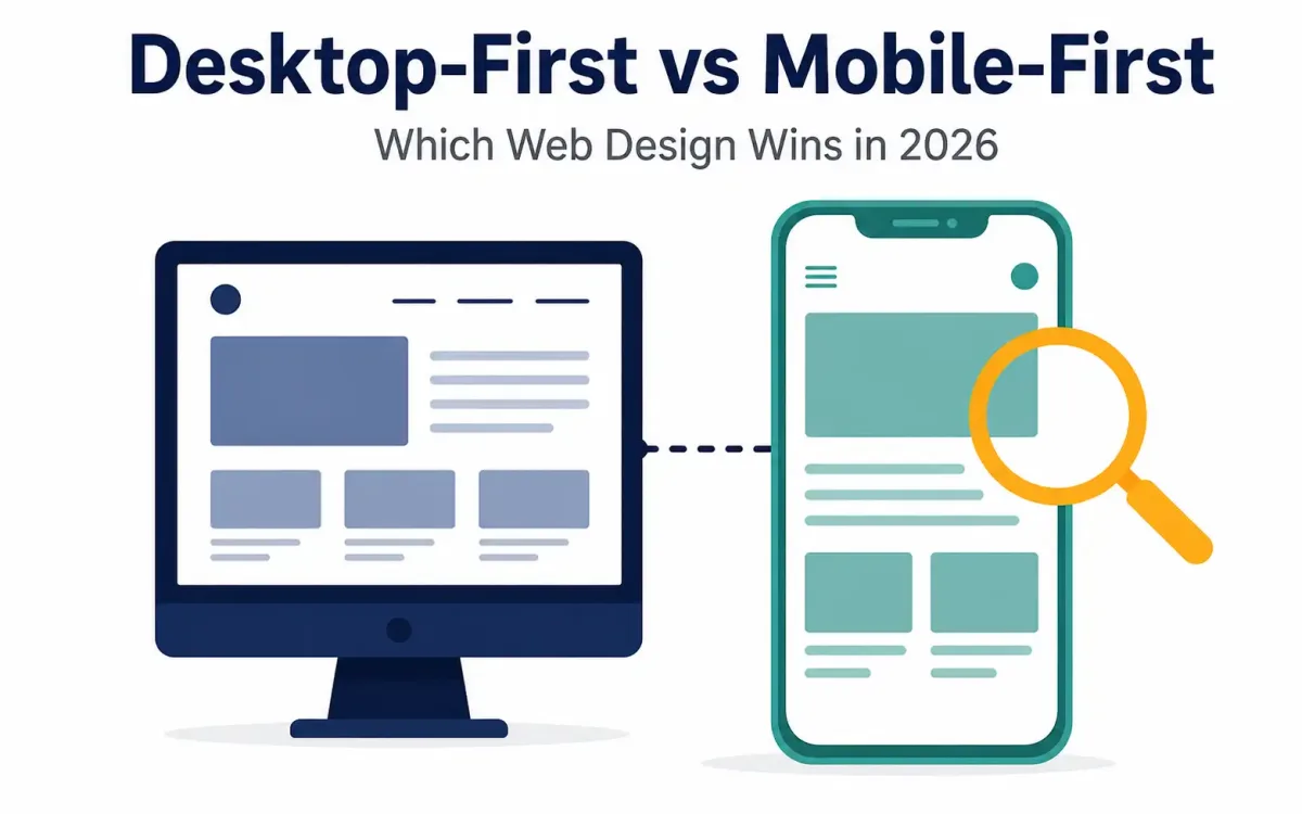
This debate looked different in 2021 than it does now, and the single biggest reason is something the original framing of this question often leaves out entirely: Google doesn’t index your desktop site anymore. Since rolling out mobile-first indexing and completing it across effectively all websites by the early 2020s, Google predominantly crawls, indexes, and ranks sites based on their mobile version — regardless of where your actual traffic or your ideal customer happens to sit. That single fact changes this decision more than almost any other factor discussed below, and it’s worth understanding before developing your website or getting into the business-specific considerations that follow.
Why Mobile-First Indexing Changes the Calculation
Google’s mobile-first indexing means the crawler evaluates your site largely as a mobile visitor would experience it — the content, internal links, and structured data on your mobile version are what determine your search rankings, even for searches performed on desktop. If your mobile site has less content than your desktop version, missing internal links, or stripped-down navigation compared to desktop — a common pattern from the era of separate “m-dot” mobile sites — Google may not see or credit that missing content at all for ranking purposes.
This has a direct, practical consequence: even a business whose actual customers are overwhelmingly desktop users (a B2B software company, for instance) still needs a fully-featured, complete mobile version of its site, because that’s what Google is actually evaluating. Your traffic source and Google’s indexing source are two separate things, and treating them as the same thing is one of the more consequential mistakes a business can make with its web strategy today.
Current Traffic Reality: Mobile Dominates Globally, With Real Exceptions
Global mobile traffic now sits at roughly 60-64% of all web traffic, compared to desktop’s 33-39% (tablet makes up the small remainder), according to current analytics aggregators like StatCounter. This is a genuinely different picture than a decade ago, when desktop held a clear majority. In mobile-heavy markets — India, Indonesia, Nigeria, and other regions with high smartphone penetration — mobile traffic share often runs even higher, sometimes exceeding 75-80% of total web usage.
That said, the original observation that B2B and B2C traffic patterns differ still holds up, just with an important nuance. B2B and professional-services sites do still see meaningfully higher desktop traffic shares than the general average — often in the 45-60% desktop range, well above the roughly 35-40% desktop share seen globally — since business purchasing decisions frequently happen at a work desktop during the actual conversion or negotiation stage.
However, the research and discovery phase leading up to that conversion increasingly happens on mobile even for B2B buyers — one industry estimate puts roughly two-thirds of B2B buyers researching on mobile before ultimately converting on desktop. This means a B2B site that treats mobile as an afterthought risks losing potential buyers during research, even if the eventual purchase or contract signing happens on a desktop device.
Consumer-facing businesses with a physical, local-service dimension — restaurants, retail, home services, healthcare with walk-in patients — consistently see mobile traffic shares well above the global average, frequently exceeding 75%, since these are exactly the searches people make on their phones while out and about (“emergency dentist near me,” checking a restaurant’s hours before walking in).
Desktop-First and Mobile-First Are Somewhat Outdated Framings
It’s worth naming something the original version of this comparison didn’t: “desktop-first vs. mobile-first” as a one-time strategic choice made at the start of a project is largely a framing from an earlier era of web development. Two approaches that used to be common — separate mobile subdomains (the old “m.example.com” pattern) and server-side adaptive design (detecting device type and serving different templates) — have both fallen out of favor. Separate mobile sites required duplicate content management and constantly fell out of sync with their desktop counterparts; adaptive design proved unreliable at device detection and roughly doubled ongoing maintenance costs.
Responsive design — a single codebase that adapts its layout via CSS breakpoints across screen sizes — is now the dominant, default approach for the vast majority of new websites, largely replacing the need to choose one platform to design “first” and adapt from there in the way this comparison originally framed it. Within responsive design specifically, “mobile-first” today more commonly refers to a development methodology — writing your base CSS styles for the smallest screen size first, then adding complexity and layout changes at larger breakpoints — rather than a business-level strategic decision about which audience to prioritize. This is a meaningfully different, more technical distinction than the original comparison presented.
When Desktop Considerations Still Matter Most
None of this means desktop experience should be neglected — it means the framing shifts from “which one first” to “make sure both are genuinely complete, with mobile-first indexing in mind.” A few situations where desktop experience specifically deserves extra design attention:
- Complex, data-dense interfaces — pricing tables, loan calculators, scheduling systems, multi-step configuration tools, or large product catalogs — are genuinely harder to use well on a small screen, and businesses in this category should invest heavily in making sure the desktop experience doesn’t feel like an afterthought bolted onto a mobile-first design, even while ensuring the mobile version remains fully functional and complete for indexing purposes.
- Older or highly specialized target audiences. Certain older industries (building supplies, industrial equipment, some professional services) and older demographic segments do skew more heavily toward desktop use, and understanding your specific audience’s actual behavior through analytics remains the right way to calibrate design priorities, even within an overall mobile-first indexing environment.
- B2B sales and negotiation workflows. As noted above, if your actual conversion event — a contract, a large purchase, a detailed proposal review — reliably happens at a desktop, that experience needs to be excellent, even if the earlier research phase and the SEO foundation both depend heavily on mobile completeness. It’s important to consider the type of business you’re running before assuming any single pattern applies universally.
A Practical Framework for Deciding
Rather than treating this as a binary choice, a more useful set of questions for 2026:
- Is your mobile site content-complete relative to desktop? If any content, internal links, or structured data exists only on desktop, that’s invisible to Google’s indexing and is the first thing to fix regardless of your actual traffic mix.
- What does your own analytics data actually show about your traffic split, not assumptions based on industry stereotypes? A “B2B company” assumption about desktop dominance may not hold for your specific audience, and the data is directly available in most analytics platforms.
- Where does your actual conversion event happen, and does that experience get appropriate design investment, separate from the indexing question?
- Are you using genuinely responsive design, rather than legacy separate mobile sites or adaptive server-side detection, both of which carry real maintenance and consistency costs that responsive design avoids?
- Does your content strategy avoid hiding meaningful content on mobile purely to save screen space? This was once common practice and is now a direct SEO liability given mobile-first indexing.
Mobile Performance Now Directly Affects Rankings, Not Just Usability
Beyond content parity, Google’s page experience signals specifically evaluate mobile performance metrics — Core Web Vitals measured from a mobile perspective, touch target sizing, and font legibility on small screens are all ranking-adjacent factors, not just usability nice-to-haves. Current estimates suggest only around 39-48% of websites pass all three Core Web Vitals thresholds on mobile, which represents a genuine competitive opportunity: sites that do get this right have a real, measurable edge over the roughly half of competing sites that don’t. This is worth checking directly — Google’s own PageSpeed Insights tool reports Core Web Vitals specifically for the mobile version of a page, separate from desktop results, and the two can differ substantially on the same site.
Frequently Asked Questions
If my customers are mostly on desktop, do I still need to worry about mobile-first indexing?
Yes. Indexing and traffic are separate concerns. Even if 80% of your actual visitors arrive on desktop, Google still primarily evaluates your mobile version to decide whether your site shows up in search results at all — a B2B software company with desktop-heavy customers still needs a complete, fully-indexed mobile experience to be found in the first place.
Are separate mobile websites (m.example.com) still a reasonable option in 2026?
Generally no. This pattern has fallen out of favor because it requires maintaining duplicate content across two separate sites, which reliably falls out of sync over time and creates exactly the content-parity problems mobile-first indexing penalizes. Responsive design, using a single codebase, is the standard recommended approach today.
What’s the actual difference between “responsive design” and “mobile-first design” as terms?
Responsive design describes a site that adapts its layout across screen sizes using a single codebase. Mobile-first, as a development methodology, describes the specific practice of writing base CSS for the smallest screen first and adding complexity for larger screens — it’s a technique used to build responsive sites, not a separate alternative to responsive design.
How do I find out what percentage of my own traffic is mobile vs. desktop?
Any standard web analytics platform (Google Analytics being the most common) reports device-category breakdowns directly, typically under an audience or technology section. This is more reliable than assuming your industry’s general pattern applies to your specific business.
A Worked Example: Auditing an Existing Site
Say you run a mid-sized B2B software company and want to know whether your current site is actually in good shape under this framework, rather than starting a redesign from scratch. A practical audit sequence:
- Compare mobile and desktop content directly. Load both versions side by side and check whether any product details, case studies, or internal links exist on desktop but are hidden, collapsed, or removed entirely on mobile. This is the single highest-priority item to fix, since it’s a direct indexing liability.
- Run Google’s PageSpeed Insights on your key pages, checking the mobile-specific Core Web Vitals score separately from desktop. A large gap between the two scores usually points to unoptimized images, render-blocking scripts, or layout shifts that specifically affect the mobile experience.
- Check your analytics for actual device split and behavior, not assumptions. Look specifically at whether mobile visitors bounce faster than desktop visitors on key pages — a meaningfully higher mobile bounce rate on a page with similar traffic volume often signals a usability problem specific to the mobile layout, not just a traffic-mix artifact.
- Identify your genuine desktop-critical workflows — a pricing calculator, a multi-step demo request form, a detailed technical specification page — and verify these remain usable on mobile even if you expect most serious engagement with them to happen at a desktop later in the buying process.
- Confirm you’re using responsive design, not a legacy separate mobile subdomain or device-detection-based adaptive template, both of which create the exact content-parity risks this entire framework is built around avoiding.
This kind of audit typically surfaces concrete, fixable issues faster than a full redesign conversation, and it directly targets the specific mechanism — content parity under mobile-first indexing — that most affects search visibility regardless of your actual audience’s device habits.
Conclusion
The honest 2026 answer to “desktop-first or mobile-first” is that the framing itself has shifted. Google’s mobile-first indexing means every business, regardless of its actual audience’s device habits, needs a fully complete mobile experience for search visibility. Layered on top of that baseline requirement, real differences in audience behavior — B2B’s continued desktop strength at the conversion stage, older or specialized industries’ desktop leanings, local-service businesses’ heavy mobile skew — still matter for where to invest additional design polish and attention.
The right approach isn’t choosing one platform to prioritize once at the start of a project; it’s building a genuinely responsive site that’s complete on mobile by default, then directing extra design investment toward whichever platform your specific data shows matters most for your actual conversion path.