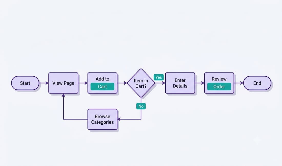
A user flow is the step-by-step path a person takes through an app or website to complete a specific goal — signing up for an account, buying a product, resetting a password, or booking a reservation. It maps every screen, decision, and action from the starting point to the finished task, giving designers a clear picture of the journey before a single line of code is written.
If you’re new to UX design, user flows are one of the first concepts worth mastering, because they shape whether a product feels effortless or frustrating. This guide explains what user flows are, how they differ from related tools, the symbols used to build them, how to create one step by step, and the tools that make the job easier.
What Is a User Flow, Exactly?
A user flow is a visual diagram that represents the sequence of steps a user follows to accomplish a defined task. The key word is task: a user flow is always goal-oriented. It doesn’t map every possible click on a site — it maps the specific route to completing one objective.
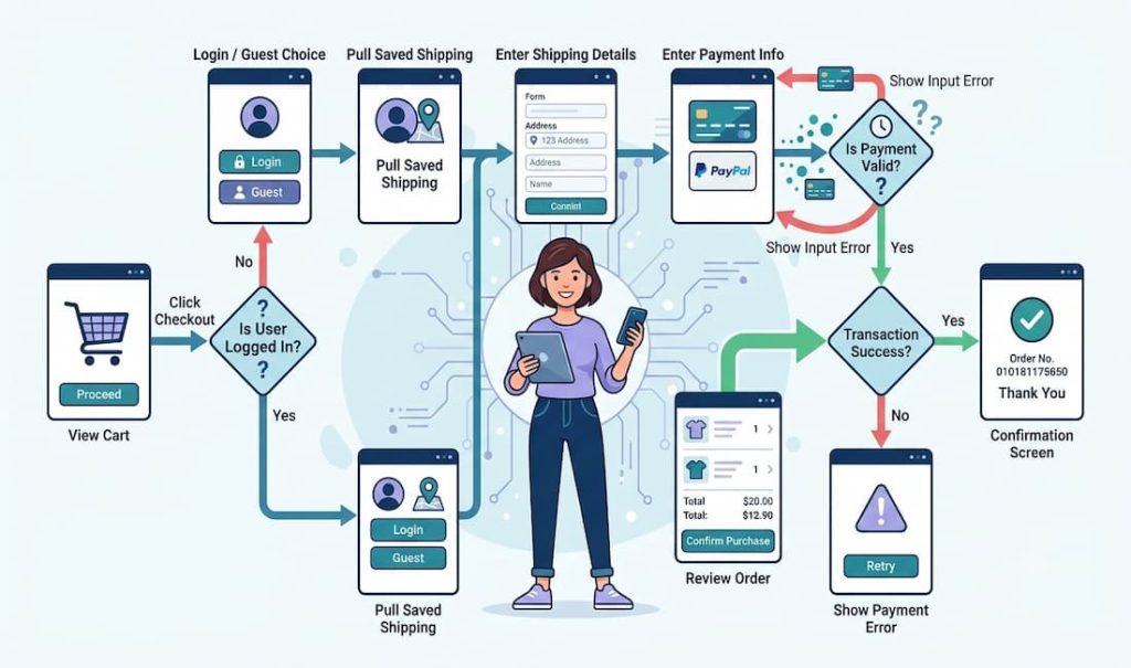
For example, an e-commerce “checkout” user flow might run: view cart → click checkout → enter shipping details → enter payment → review order → confirm purchase → see confirmation screen. Each of those is a step, and between some steps there are decisions (Is the user logged in? Is the payment valid?) that branch the path.
It’s worth clearing up a common beginner mistake: navigation is not the same as a user flow. Clicking between menu tabs is general navigation. A user flow is the deliberate, goal-focused sequence that leads a user from an entry point to a completed action. Understanding that distinction is the foundation of everything else.
User Flow vs. User Journey vs. Task Flow
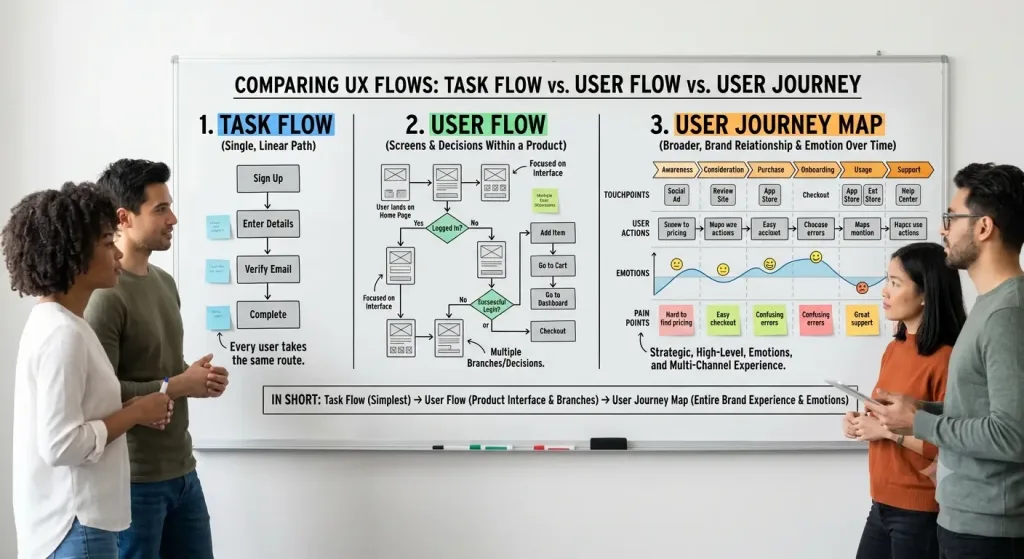
These terms are often used interchangeably, but they describe different things. Knowing the difference will save you a lot of confusion.
- User flow — a diagram of the screens and decisions a user moves through to complete a task within a product. It’s focused on the interface and the steps.
- Task flow — a simpler, linear version showing a single path with no branching (every user takes the same route). A user flow can include multiple branches; a task flow usually doesn’t.
- User journey map — a broader, higher-level view of a user’s entire experience with a brand over time, including their emotions, motivations, and pain points across multiple touchpoints (not just one product or task). It’s more strategic and less about specific screens.
In short: a task flow is the simplest, a user flow adds branching and decisions within a product, and a user journey map zooms all the way out to the whole relationship between user and brand.
Why User Flows Matter in UX Design
User flows earn their place in the design process for several concrete reasons.
They create intuitive, low-friction interfaces
Mapping the path in advance lets designers spot dead ends, unnecessary steps, and points of confusion before building anything. The result is an interface users move through smoothly, which directly supports higher conversion rates because people can finish what they came to do without getting lost.
They reveal problems in an existing product
If you already have a live website or app, charting its user flows exposes where users hit friction. You can see exactly which steps are functional and which cause drop-off, then target those weak points with specific fixes rather than guessing.
They keep the planning phase focused
Without a user flow, it’s easy to get lost in visual details and feature ideas too early. A flow forces you to define the target user, their goal, and the essential steps first — giving the whole project a clear backbone before design details are layered on.
They make communication with stakeholders easier
Most clients and stakeholders aren’t designers. A user flow diagram breaks the experience into simple, visual steps that anyone can follow, which makes design reviews and sign-offs far smoother. It turns an abstract concept into something a non-designer can react to and approve.
They improve team collaboration
Product teams include designers, developers, project managers, and others. A shared user flow gives everyone a single reference point, so discussions stay grounded and the team can align on one agreed-upon interface instead of talking past each other.
They reduce costly design errors
Fixing a design errors on a user flow diagram takes minutes. Fixing the same problem after it’s been designed and coded takes hours or days and real money. Catching issues at the flow stage — before development — is one of the cheapest forms of insurance in the whole process.
They serve as documentation
User flows double as a record of how a product is meant to work. When you revisit a project later, or onboard a new team member, the flow chart is a clear reference for the intended experience.
The Building Blocks: User Flow Symbols
User flows use a small set of standardized flowchart symbols. Learning these five is enough to read and build most flows:
- Start/End point (oval or rounded rectangle) — marks where the flow begins (the entry point) and where it ends (goal completed).
- Action or screen (rectangle) — represents a step, screen, or action the user takes, such as “Enter email address” or “View product page.”
- Decision (diamond) — a branching point with a yes/no or either/or question, such as “Is the user logged in?” The flow splits based on the answer.
- Arrow (directional line) — connects the shapes and shows the direction of movement from one step to the next.
- Input/output (parallelogram) — optional; represents data the user enters or receives, like a form submission.
With just these, you can diagram the vast majority of user flows clearly enough for a whole team to understand.
How to Create a User Flow, Step by Step
Building your first user flow is straightforward if you follow a clear process.
- Define the user’s goal. Start with the specific task the flow will cover — “create an account,” “complete a purchase,” “book an appointment.” One flow, one goal.
- Identify the entry point. Determine where the user begins. Do they arrive from a homepage, an ad, an email link, a search result? The starting point shapes the flow.
- List the steps to completion. Write out every action and screen between the entry point and the goal, in order. Keep it focused on what’s necessary.
- Add decision points and branches. Wherever the path can split — logged in vs. not, valid vs. invalid input, in stock vs. out of stock — insert a decision diamond and map both outcomes.
- Map it visually with symbols. Lay the steps out using the flowchart shapes above, connected with arrows, moving generally left-to-right or top-to-bottom.
- Review, test, and refine. Walk through the flow as if you were the user. Look for dead ends, redundant steps, or confusing branches, and simplify. Share it with your team for feedback.
The goal at the end is a diagram that shows the cleanest possible path to the user’s objective, with every necessary decision accounted for.
A Simple Example: E-Commerce Checkout Flow
Here’s how the pieces come together for a common task — buying a product:
Start → Product page → “Add to cart” → View cart → “Checkout” → Decision: Logged in? → (No) Sign in or continue as guest → (Yes) Enter shipping address → Enter payment details → Decision: Payment valid? → (No) Show error, return to payment → (Yes) Review order → Confirm purchase → Order confirmation screen → End
Reading it back, you can immediately see where a user might drop off — being forced to create an account, or a clumsy payment-error loop — which is exactly the kind of insight a user flow is built to surface.
Tools for Creating User Flows
You don’t need to draw user flows by hand. Popular tools designers use include Figma and its whiteboard companion FigJam, Miro, Lucidchart, Whimsical, and Draw.io. These offer ready-made flowchart shapes, drag-and-drop editing, and real-time collaboration so teams can build and review flows together. For quick sketches, even pen and paper works — the thinking matters more than the tool.
Understanding User Flows Is Vital
User flows are one of the most practical tools in a UX designer’s kit. They turn an abstract idea of “how the product should work” into a concrete, visual map that reveals friction, guides the build, and keeps everyone aligned. When a user can move through a site or app and complete their goal without confusion, the design has done its job — and loyal, satisfied users usually follow.
For beginners, the takeaway is simple: before you design screens, map the path. Define the goal, chart the steps, account for the decisions, and refine until the route is as clear as possible. Master that habit, and you’ll build products that feel effortless to use — which is the whole point of UX design.