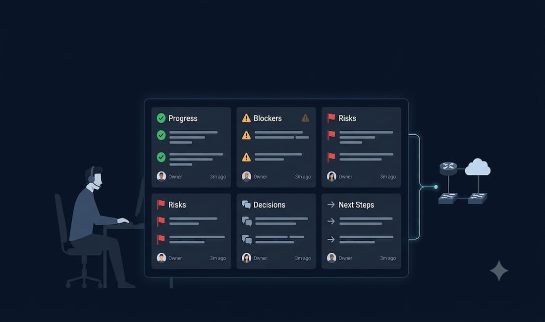
If you have ever been the person pinged at 2 a.m. about a production issue that “only happens in staging,” you already know the problem: network and IT teams don’t suffer from a shortage of data. They suffer from a shortage of signal. Updates scatter across Slack threads, decisions live in people’s heads, and reconstructing the timeline of what changed and when can feel like detective work. A real-time team performance dashboard doesn’t just organize the chaos — it shortens the path from issue to action.
This guide covers what a high-quality dashboard should surface for network and IT teams, how to run it without creating more process overhead, and what makes the whole system trustworthy enough that leadership will rely on it when it counts.
The Visibility Gap That Slows IT Teams Down
Network and IT excellence is mostly a coordination problem. You already have monitoring tools, configuration management, and deployment pipelines. What most teams lack is a consistent, shared picture of:
- What moved forward today, and why it matters
- What is blocked, who owns the fix, and how long it has been stuck
- What decisions were made, by whom, and what changed as a result
- Which risks are growing and where mitigation is falling behind
Without that picture, teams default to status meetings, war rooms, and DM archaeology. A team performance dashboard reduces that overhead by collecting short, frequent signals at the source and organizing them into something leaders and peers can actually act on.
Research from Atlassian found that the average employee wastes over 31 hours per month in unproductive meetings, and IT teams — which rely on high-context coordination across incidents, changes, and projects — are among the hardest hit. A dashboard that replaces status calls with structured async updates directly recovers that time.
What Real-Time Actually Means for IT and Network Operations
Real-time is less about blinking charts and more about current, decision-ready context. For infrastructure and operations teams, that means:
- Fresh entries from brief check-ins, available immediately in a shared view
- Clear ownership on blockers, risks, and next steps so escalation takes minutes rather than hours
- Filters by service, customer, project, or role so each viewer sees what is relevant to them
- A searchable history of changes you can cite in post-mortems and stakeholder updates
A team performance dashboard isn’t another system to feed — it’s a lens on work already happening.
Core Signals a Network and IT Dashboard Should Surface
Think of your dashboard as a living brief, not a data lake. The most actionable views map to a handful of concrete signal types:
Progress — what shipped or moved forward, with links to impacted services or customers.
Blockers — what is stuck, how long it has been stuck, and who owns the next action. Visibility here is the single biggest driver of faster resolution. Google’s Site Reliability Engineering research found that mean time to resolution (MTTR) drops significantly when ownership and blocker status are visible across the team in near-real time.
Risks — known fragility, capacity concerns, or sequencing conflicts surfaced early, before they become incidents.
Decisions — what was decided, by whom, and what changed. Without a decision log, teams relitigate the same ground repeatedly.
Next steps — the very next unit of work, with an owner and a timeframe attached.
Time windows — this week, last 14 days, this month, this quarter, so trends are visible without manual report-building.
For network teams specifically, the dashboard should also integrate operational metrics: uptime and availability by service, mean time to detect (MTTD) and MTTR per incident, change failure rate, open ticket aging, and on-call escalation frequency. These give a complete operational picture alongside the qualitative team signals above.
Useful team dashboards respect permissions and context. Access should follow role and department rules so team members share honestly and leaders see what they need without information overload.
Practices That Make Dashboards Work in the Real World
Tools don’t fix culture, but small process choices change outcomes. Teams that get lasting value from dashboards tend to do five things consistently:
Keep input lightweight. Updates should take 60 to 90 seconds — brief enough to do honestly, structured enough to be comparable across the team.
Standardize just enough. A short format — wins, blockers, risks, next steps — keeps entries useful without requiring a template-filling exercise.
Set a predictable rhythm. Automated reminders matched to each role: hourly during active incident response, daily for NOC operations, weekly for project work, monthly for architecture reviews.
Centralize signals. Pull relevant notes from wherever work decisions happen — Slack, ticketing systems, quick voice inputs — into the same place so the dashboard reflects reality.
Make entries verifiable. Include author, timestamp, and service or project context so anyone can trace a claim back to its source. This is what separates a useful knowledge base from a collection of unattributed assertions.
Do these consistently and the dashboard stops feeling like reporting. It starts feeling like shared awareness — the kind that shows up in faster incident response and shorter planning cycles.
A 28-Day Rollout Plan for IT and Network Teams
You don’t need a program. You need a pilot that proves value quickly.
Week 1 — Define your signals. Pick one team or a single high-impact service. Write three to four role-specific update prompts: what moved forward today, what blockers need help, what is the top risk this week, and what is the next concrete step with an owner. Keep each prompt answerable in two to three sentences.
Week 2 — Capture with low friction. Use short text entries or voice capture for updates. Send automated reminders with direct links that take people straight to their current prompt — no login hunting. Track completion rate by role to identify where the habit is sticking and where it needs nudging.
Week 3 — Publish the first internal brief. Compile entries into a short internal report: executive summary, progress highlights, open blockers with owners, risks, and decisions made. Review it with the team to resolve blockers and confirm ownership. This review should replace, not supplement, your standing status call.
Week 4 — Expand and measure. Add Slack channels where work decisions already happen so updates flow in automatically. Track the metrics below to measure impact. Replace one more recurring status meeting with async updates and a shorter decision session. If the pilot saves two or more hours per person per month and shortens decision cycles, expand to a second service or department.
Metrics That Matter for IT Leaders
Measure lightly; act consistently. These indicators give a clear read on momentum and drag:
- Update completion rate by role (signals habit adoption)
- Mean time to decision — from issue raised to owner assigned
- Top recurring blockers and average resolution time
- Meeting hours per team per month spent on status updates
- Report preparation time recovered through automation
- Stakeholder inquiry response time using source-linked answers from the dashboard
A well-built team performance dashboard makes these trend lines visible without extra bookkeeping.
Guardrails for Trust and Security
Network and IT teams carry higher stakes around privacy, compliance, and operational security. Any dashboard system brought into this environment should meet these standards:
Role-based permissions — data access follows department and role rules end to end, so visibility is always appropriate to the viewer.
Defined capture scope — public channels can be monitored broadly; private channels require an explicit invite; direct messages stay private. This boundary needs to be clearly communicated to the team.
Data scope clarity — message text, timestamps, reactions, and thread context are useful; file contents and credentials should never be stored.
Encryption and isolation — data encrypted in transit and at rest; customer data segregated and not used for model training.
Verifiable outputs — reports and query answers should cite the exact entries used, with author and date, so anyone can audit the source.
Trust in the dashboard is earned when every team member understands what is captured, who can see it, and why.
How a Dashboard Improves Both Speed and Quality
Once you have a current, structured picture of work, several compounding benefits follow:
Fewer interrupts. Leaders self-serve context from dashboards and structured reports, which means fewer status DMs and fewer ad-hoc calls pulling engineers out of focus time.
Faster escalation. Clear ownership on blockers — visible to the whole team — shrinks the time between a problem surfacing and someone acting on it.
Better post-mortems and planning. Decisions, risks, and outcomes documented in structured updates give you the raw material for honest retrospectives and better estimates.
Smarter stakeholder communication. Internal briefs and customer-facing reports become a byproduct of the same signals your team already produces, not a separate writing exercise.
Tool Spotlight: BeSync’d
Note: The following section describes a third-party tool. Evaluate it against your team’s requirements and security standards before adopting.
BeSync’d is a platform designed to streamline team work updates. It integrates with existing sources — including Slack — to compile cross-team summaries, customer reports, and a permission-aware knowledge base, without adding heavy process overhead. For IT and network teams, it covers four practical use cases:
Team member work updates — administrators configure update prompts and cadence by role. Team members receive email reminders with time-limited, secure links that open directly to their current prompt. Entries can be submitted by voice or text, are transcribed and structured automatically, and are editable by the contributor or manager afterward.
Integrated channel capture — relevant activity from Slack public channels flows in automatically. Private channels capture only when the bot is explicitly invited. Group DMs are optional and off by default. File contents are not stored.
Team dashboards and internal reporting — activity dashboards show what moved, what is stuck, and where risks may be growing. Weekly or monthly reports are generated as editable PDFs — executive summary, achievements, challenges, risks, and next steps — and can be emailed or downloaded directly.
Knowledge base assistant — search across team activity with natural questions: “top blockers in Engineering last 14 days” or “what changed for this customer this week.” Answers include citations linking to the exact entry, author, and date. Retrieval respects role and department permissions throughout.
On the security side, BeSync’d runs generative capabilities on AWS Bedrock with per-customer infrastructure isolation, encryption in transit and at rest, and a policy against using customer data for model training.
For many IT leaders, the value is direct: you get a real-time team performance dashboard built from signals your team already produces, organized for decisions, and designed to meet the security bar that IT environments require. Learn more about their knowledge base of company activity.
Connecting the Dashboard to Broader Team Communication
A real-time performance dashboard works best when it sits inside a broader strategy for team communication. Integrating updates with the platforms where work decisions already happen — Microsoft Teams, Slack, ticketing systems — removes the friction of a separate reporting tool and ensures the dashboard reflects what is actually going on rather than what teams remembered to log.
Conclusion
High-performing network and IT teams don’t rely on heroics. They rely on clarity. A well-built team performance dashboard makes clarity routine: short inputs from the team, a predictable rhythm, centralized signals, and structured summaries that give leaders what they need without pulling engineers away from the work. The result is fewer status scrambles, faster decisions, and a team that can demonstrate progress with evidence rather than anecdote.
The first step is smaller than it sounds. Pick one team, define four update prompts, run the pilot for a month, and measure what changes. The dashboard earns its place by making two things obvious: where things are moving, and where they are not.